FINA WORLD SWIMMING CHAMPIONSHIP
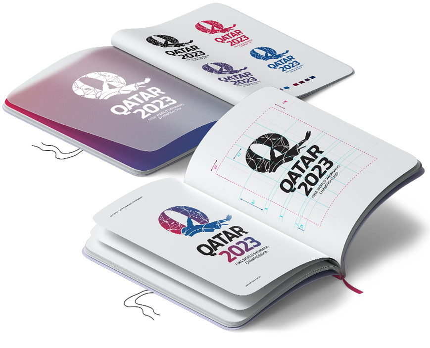
To celebrate these values, Formatum created a brand that completely embodies the sport—a brand made of swimming. The Qatar 2023 brand lives where the game takes place: The identity and graphic system are inspired by the movements that happen inside the water.

The ornament applied inside the logo and in all applications of the brand identity, is a combination of circles.
Circle is the form of basically all movements of a swimmer in the pool. The circle is the rotation of the arm, is the spin under the water before going for more 50 meters.
It is the trail of speed left in the water. Circle is the reaction of water when something touches it.
In the graphic system, each circle touches each other as a swimmer would be moving foward, creating different forms, like a wing from a swimmer.
The lines that cut the circles are like the lanes in the pool.


The brand colors are the integration of the Qatar flag with the blue of the water. The full brand identity beside of definition of logo, typography and colors, includes the design of pictograms, patterns and elements applied on print and screen
EXPERIENCE
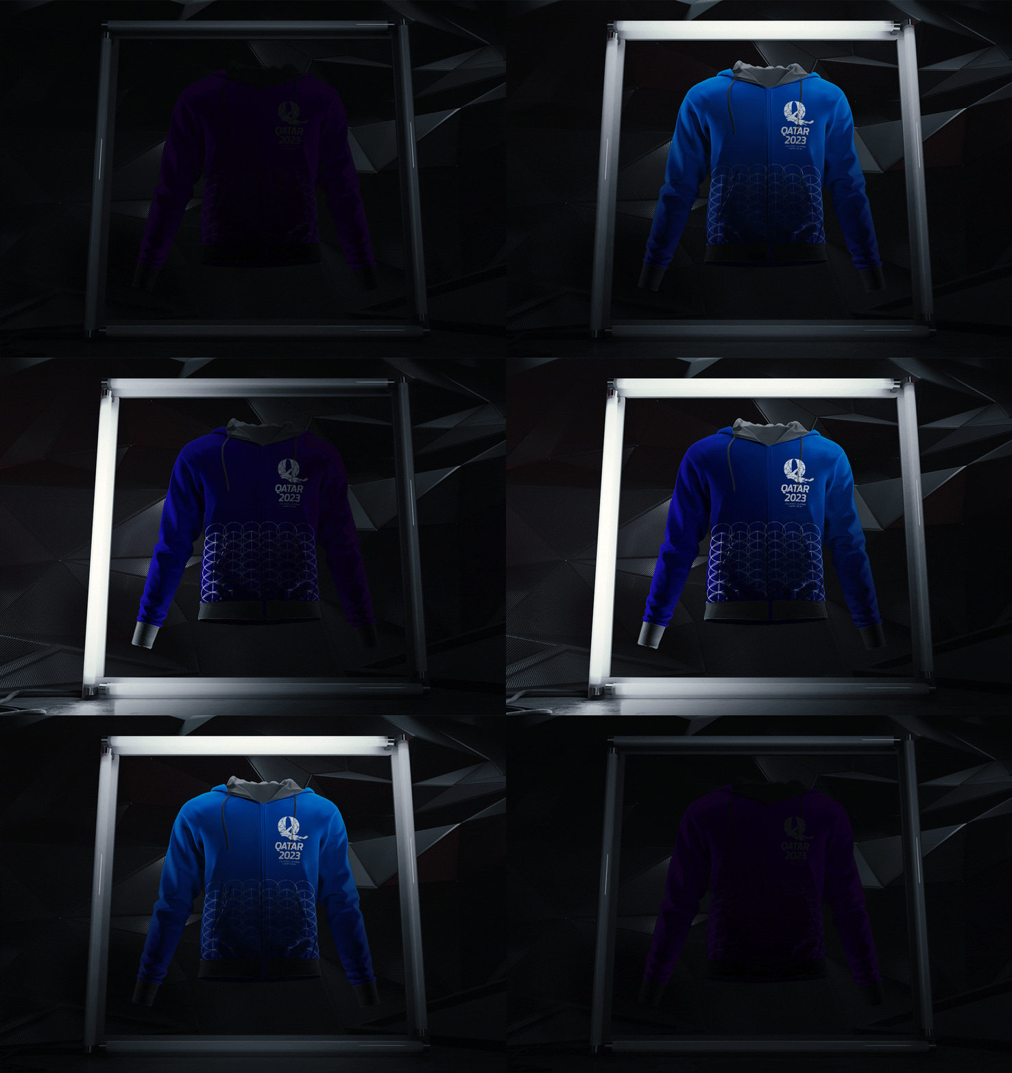
Swimming is made of individuals who come together to create exceptional stories of performance and beauty, and the Qatar 2023 brand celebrates these moments of magic. Formatum has created a full experience for fans and athletes alike, from in-stadium and on-screnn graphics, staff uniforms, event tickets, medals, to designs for the brand communication and event promotion.

Brand design for the tickets

Promotional package for ticket sales

a full
experience
for fans and
athletes
alike.

Stadium branding

In-stadium branding

Brand communication. The slogan “hold your breath” connects the viewer’s emotion with the swimmer’s energy in the pool
that
completely
embodies
the sport.
A brand
made of
swimming.

Concept of event promotion applied on a Zeppelin


